Excel + CAN Bus Data [Parquet Data Lakes | Athena | DuckDB]

Want to analyse terabytes of CAN bus data in Excel?
In this article we show how you can use Excel to load and process large volumes of CAN/LIN data from the CANedge CAN bus data logger.
Specifically, we use the MF4 decoders to DBC decode raw CAN bus data into a Parquet data lake. We then use ODBC drivers to illustrate how you can query this data using either Amazon Athena (from AWS S3) or DuckDB (from local disk).
Teaser: In this article we also show how you can integrate your CAN data to build dynamic Excel dashboards and reports like the below.
In this article
Why use Excel for CAN bus data analysis?
Microsoft Excel is a spreadsheet software tool, used widely within the business intelligence segment for ad hoc analysis, performance reporting and more. In this article we use Excel 2019 on Windows 10. Below are four reasons why Excel can be relevant:

Popular
Excel is the most generally known tool for data analysis - and for many users it is the preferred tool

Spreadsheets
The spreadsheet structure makes Excel uniquely flexible and suited for many types of analyses

PivotTables
Excel's PivotTables are great for working with time series data due to the built-in time grouping capabilities

Reporting
Excel is great for creating reports, combining multiple sources into simple overviews for periodic updating
The challenge: Excel plus big data
One challenge with Excel is the limit on data volume. Excel supports a max of 1 million rows per sheet.
CAN buses easily generate millions of rows per hour. Even if Excel could load this, it would become prohibitively slow.
However, in this article we show how to use Excel + Amazon Athena to analyse data across billions of rows and terabytes of data. We also show how to use Excel + DuckDB to do this locally.


Our CAN bus dataset + Excel files
The CANedge CAN bus data logger records raw CAN/LIN data from vehicles/machinery in a binary file format (MF4). Data is stored on an 8-32 GB SD with optional WiFi, 3G/4G and GPS/IMU.
For this article we use OBD2 + GPS/IMU data recorded from an Audi A6 with a CANedge2 + CANmod.gps. You can download a 'data pack' with the raw MF4 log files, the relevant DBC files and the Excel files below, allowing you to replicate all the showcases.
download data packHow to set up Excel-Athena to query CAN/LIN data from S3
In this section we outline how to set up the Excel-Athena integration.
DBC decode raw CAN data to Parquet
To load the raw CAN data in Excel, we need to first decode the raw CAN frames to physical values (degC, %, RPM, ...). This requires a DBC file and suitable software/API tools.
In this article we use our MF4 decoders, which let you easily DBC decode MF4 data to Parquet data lakes.
Parquet is a binary format like MF4 - but it is much more widely supported. While Excel does not natively support Parquet files, you can integrate with a Parquet indirectly via various 'interfaces' using something called ODBC drivers.
There are many tools that enable you to produce DBC decoded CSV files for loading in Excel. This can be done via our MF4 decoders, the asammdf GUI/API or our Python API.
A CSV with DBC decoded data can be loaded directly into Excel - or you can reference one (or more) CSV files as an external data source. The latter enables you to avoid loading the entire dataset into RAM by ensuring that you 'create a connection only'.
However, CSV is inherently slow to work with - and the above approach will not scale indefinitely. In our experience, this method is limited to CSV files of around 1-5 GB. Going beyond this level makes the workbook impractically slow to work with and refresh.
A much faster data format is Parquet files, which is what we focus on in this article.

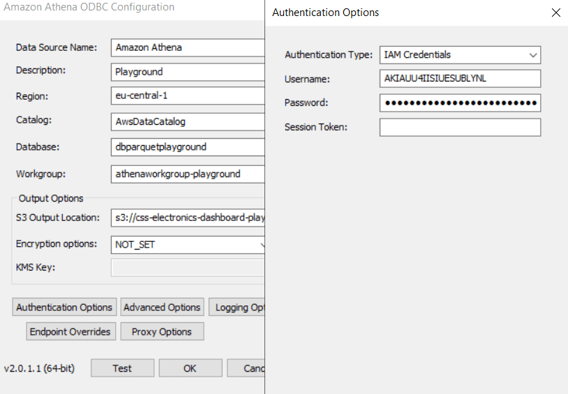
Deploy the Amazon Athena ODBC driver
In this setup we use Amazon Athena as an interface between Excel and our Parquet files. Athena lets you query data from AWS S3 based Parquet data lakes in an extremely fast, efficient and low cost manner. Data is extracted using standard SQL queries.
Since most CANedge users upload their data to AWS S3, we provide plug & play integration guides for deploying Amazon Athena in your own AWS account. The guides are focused on integration with Grafana dashboards - but once set up, Athena can be used for many other integrations incl. Excel.
As illustrated, a user might deploy a CANedge3 to upload MF4 files to AWS S3 via 3G/4G. Uploaded files trigger an AWS Lambda function, which uses the MF4 decoders and DBC file(s) to decode the raw CAN/LIN data. The Lambda function outputs the results to another S3 bucket, which can be queried by Athena.
learn moreOnce you have deployed your Parquet data lake and Amazon Athena, you can integrate with Excel in a few steps:
- Download the Amazon Athena ODBC 2.x driver
- Follow Amazon's get started guide
- Add your Athena details in the ODBC config (as in our guide)
- Test your connection to verify the setup
Test if Excel can fetch data
To test the Athena data source in Excel, we open a new workbook. Inside, we go to 'Data/Get Data/From Other Sources/From ODBC', select Amazon Athena and click OK.
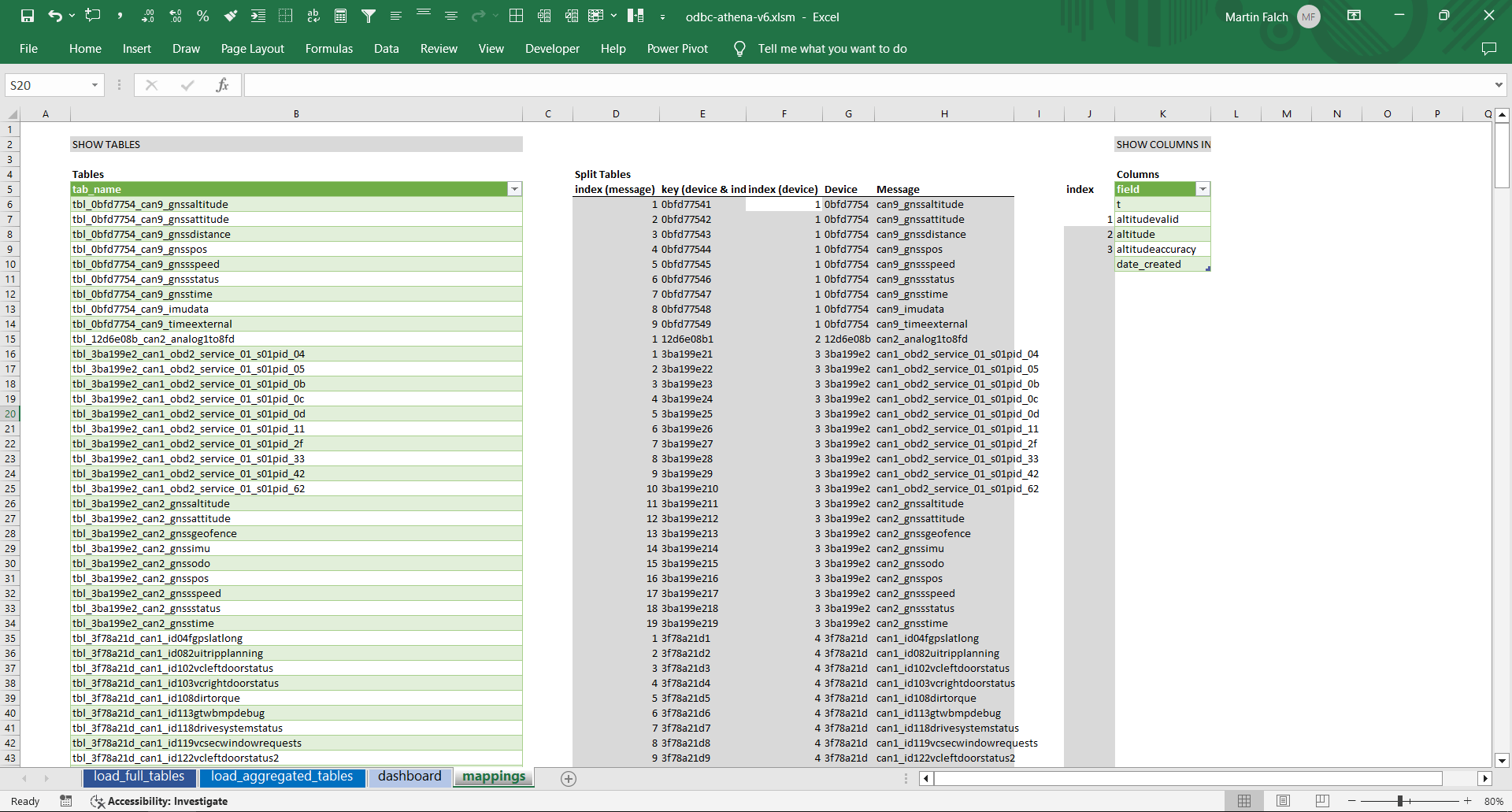
This shows an overview of our databases and tables and we can e.g. find a table like 'tbl_3ba199e2_can2_gnssspeed'. This contains signals recorded by the CANedge with ID 3BA199E2 from CAN2 in the CAN message GnssSpeed. We can now select and load the entire table into Excel (2328 rows).
With this, we are displaying data stored in an AWS S3 bucket directly in Excel by using the Amazon Athena ODBC driver.
5 showcases of Excel-Athena (incl. dashboard)
In this section, we provide practical examples of how you can work with your AWS S3 based Parquet data lake via Excel-Athena.
Example #1: Query full data tables into PivotTables
Previously we loaded a data table into an Excel Table. If we later refresh the query, the table will include any added rows, making it simple to perform updates to e.g. reports.
However, Excel Tables lack flexibility - we may prefer instead to load the data into a PivotTable. To do so, we repeat our previous steps, but select 'Load to/PivotTable Report'.
Excel then connects the data lake table directly to a PivotTable, letting us e.g. drag down the Speed signal and select the aggregation (e.g. Average) and formatting.
Importantly, Excel automatically recognizes that the column 't' is a timestamp, which enables Excel to break it into years, months, days, hours, minutes and seconds. Most of the time groupings show up automatically as options in the pivot, but if some are missing (e.g. seconds) you can select the timestamp column and go to 'PivotTable Analyze/Group Selection' and select/deselect groupings as per your needs.
This approach is quick and simple to use, but it has one major downside: Regardless of what you display in your PivotTable, Excel loads 100% of the table rows. This may be OK for thousands of rows - but not billions. As such, this method is not very useful for practical CAN analysis.
Example #2: Query aggregated data via variables
In this example we show a more flexible and scalable method.
2.1 Create simple hard coded SQL query
To avoid loading an entire table, we will interface with Athena using raw SQL queries. First, let's try a simple query:
As evident, this query returns just 1 row, not the full table. In other words, this query can be used regardless of whether our data lake table contains 1 row or 1 billion rows - from Excel's point-of-view, only a single observation is loaded.
2.2 Create a dynamic SQL query
But what if we want to query the MAX speed instead? With the previous method, this would involve many repeated steps.
Luckily, Excel lets us define the query in a cell. To do this, we add the previous query in a cell and name it 'sql_query'. We then double click our existing connection to open the 'Power Query Editor'. Here we go to 'View/Advanced Editor' and replace the existing content with the below:
sqlQuery = Excel.CurrentWorkbook(){[Name="sql_query"]}[Content]{0}[Column1],
Source = Odbc.Query("dsn=Amazon Athena", sqlQuery)
in
Source
This 'M script' tells Athena to use the sql_query named cell as basis for the connection query.
As a result, we can now modify the sql_query cell to e.g. select the MAX and update the results by refreshing the connection.
2.3 Create a dynamic time series plot
The above example is suitable if you need to extract a single value, e.g. for a report. But what if you want to plot DBC decoded CAN signals? Here we can use below SQL query:
AVG(speedvalid) AS signal1,
AVG(speed) AS signal2,
AVG(speedaccuracy) AS signal3,
NULL AS signal4
FROM tbl_3ba199e2_can2_gnssspeed
WHERE date_created BETWEEN '2020/10/29' AND '2020/10/29'
AND t BETWEEN TIMESTAMP '2020-10-29 15:00:00' AND TIMESTAMP '2020-10-29 15:20:00'
GROUP BY FROM_UNIXTIME(FLOOR(TO_UNIXTIME(t)/2)*2)
ORDER BY TIME
We add this query in a named cell (as in 2.2). Next, we replace each query variable with a cell reference. The result is a dynamic query that we can load to a PivotTable and/or PivotChart:

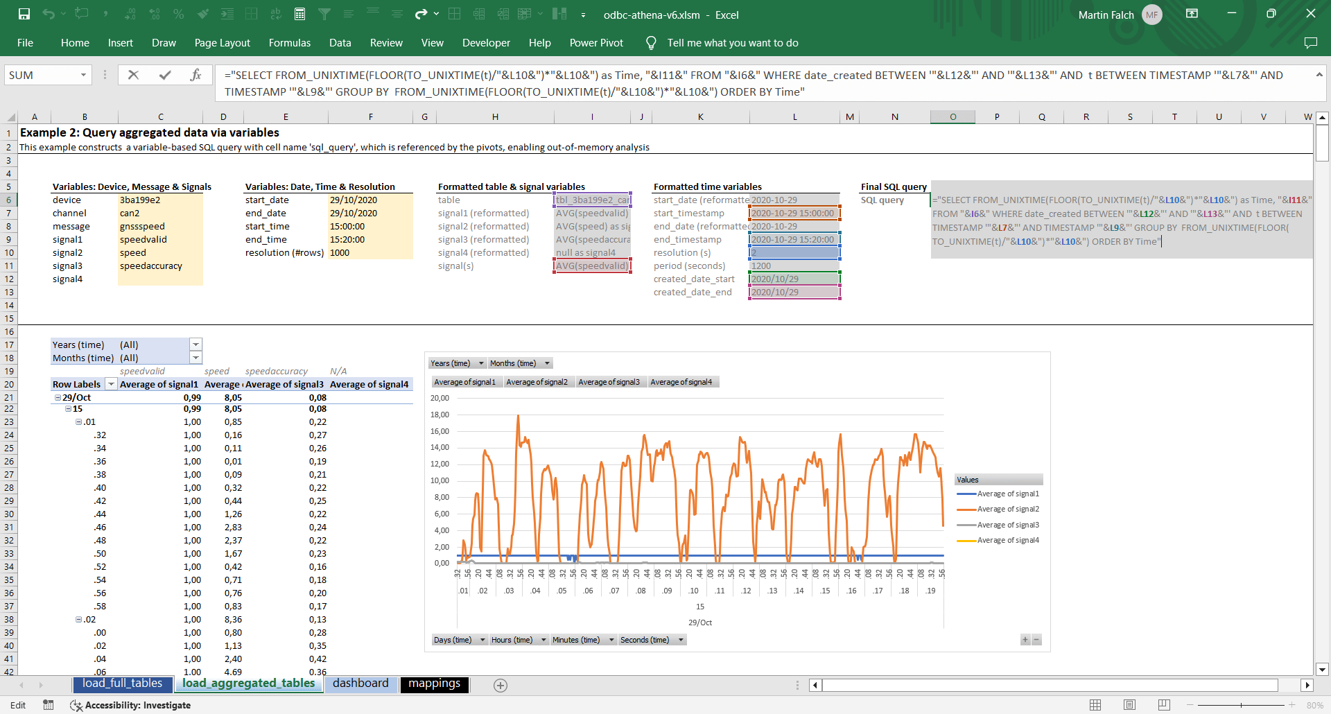
The above query is similar to queries used in our Grafana-Athena integration. In short, the query extracts a specific set of signals from a data table, just like before. But in this case we group the data by time to a specific time period (e.g. 2 second intervals), letting us visualise the time series data in a plot. Further, we filter the data to a specific date (leveraging the partitioning of the Parquet data lake for efficiency) and a specific timestamp period. This helps Athena limit what data to scan, as well as what data to return.
In setting this up, there are some considerations:
- The Athena SQL queries are sensitive to the date/time formatting, hence it's useful to separate user inputs from the final date and time formatting as per our workbook
- To avoid having to drag & drop signals into the pivot every time a refresh is done for a new table/signal, it's necessary to use 'fixed names'. This is why our query names signals as signal1, ..., signal4. By fixing the names, the pivot does not reset upon every refresh
- In our example, we allow the user to control the maximum #rows that are to be returned in the query. We then mathematically calculate the required timestamp grouping resolution to adhere to this limitation. This way, we can create meaningful time series visualisations without exceeding the limitations of Excel (and without fetching excessive data observations vs. how many pixels will be visible in the plot)
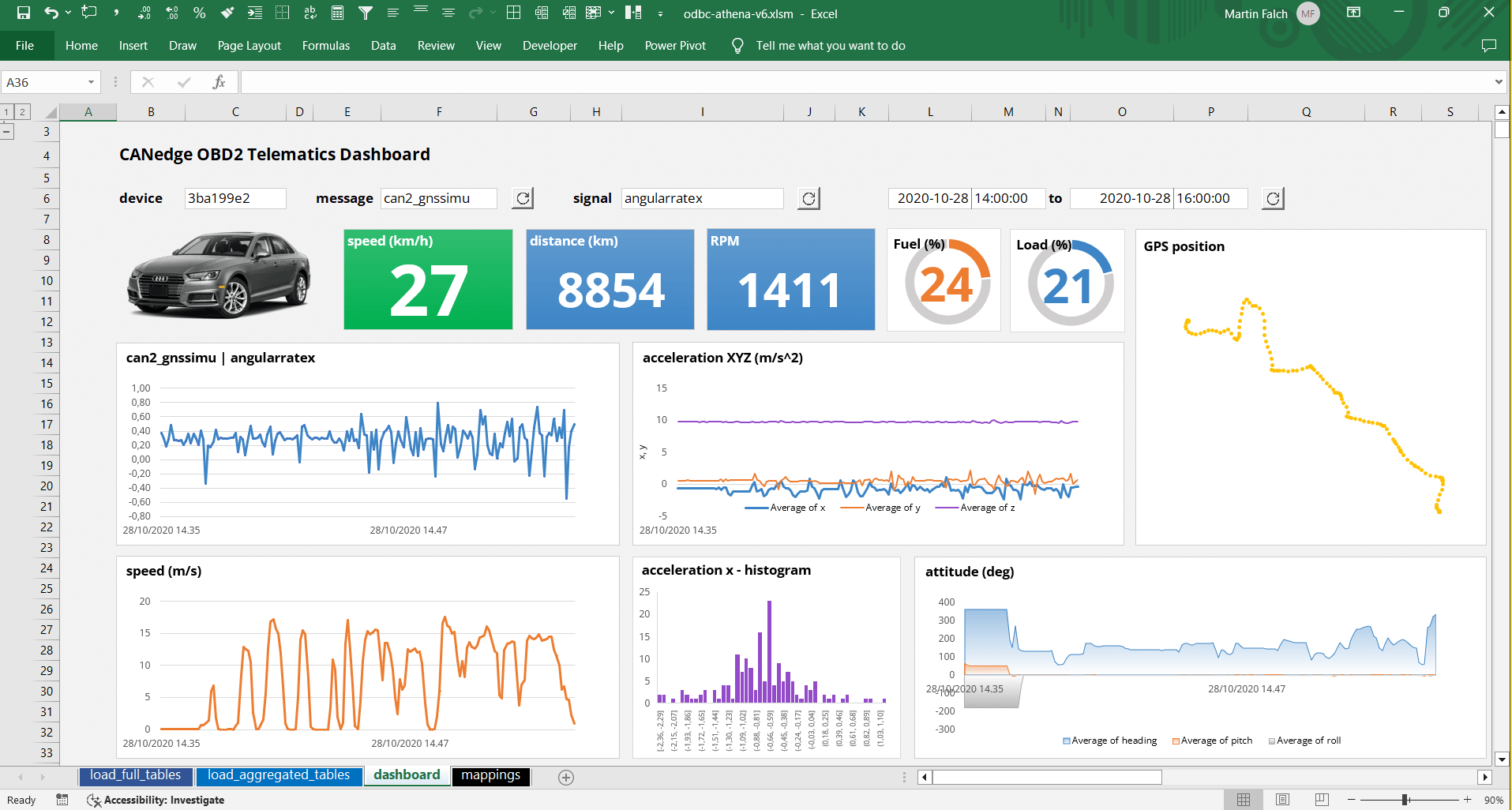
Example #3: Create an Excel dashboard with OBD2/GPS data
With the building blocks in place, let's build a dynamic Excel dashboard!
Specifically, we attempt to re-create one of our Grafana-Athena dashboard playgrounds with multiple panels that can be dynamically updated based on dropdown selections.
3.1 Create a static dashboard
First, we create shared dynamic variables (device ID and start/end date & time) for use across queries. We also create message/signal dropdowns that enable the end user to dynamically control the results of one of the dashboard panels.
Next, we construct calculated cells (with e.g. date formatting) and the SQL queries to be used in each PivotTable/PivotChart. Each query cell is given a logical name such as 'sql_ex3_panel_speed'. Once set up, we can link each query to our Athena data source.

 Header inputs, shared variables and dropdown lists
To do so, we go to 'Data/Get Data/From Other Sources/Blank Query'. This opens up the Power Query Editor. We rename the blank query to equal our 1st SQL query name reference. Then we go to the Advanced Editor and parse the same script as in 2.2, using the relevant cell name reference.
Once we've verified that the first query works as expected, we can copy/paste the connection multiple times within the Power Query editor, rename each to the relevant query reference - and update each of the M scripts via the Advanced Editor.
Once done, we go back into our worksheet and load the 1st connection to a PivotChart. In doing so, we create both a PivotTable and PivotChart. By modifying the PivotTable we can create the visualisation we want.
In our case, we prefer to use 't' as the timestamp dimension (rather than groups like month, day, hour, ...) to avoid the PivotChart getting cluttered with too many time dimensions.
It is also worth spending time formatting the 1st chart fully, then saving it as a template for use in other panels. Once done, the PivotChart can be moved to the dashboard area. You can use 'snapping' to position the chart optimally. With a bit of clever formatting, we manage to create a neat looking dashboard!
3.2 Add dynamic dropdown lists
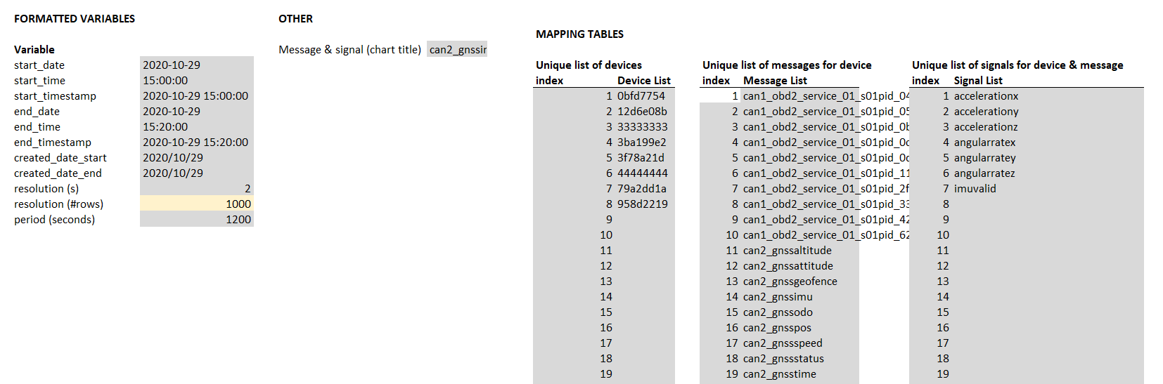
To finalise the dashboard we'll make it more dynamic. Rather than ask users to manually enter the device ID, message and signal, we create dynamic dropdowns using mapping tables.
First, we use the SQL query 'SHOW TABLES' to show all our data lake tables in one list within a separate 'mappings' sheet. With Excel string formulas, we separate the table list into two lists: Device IDs and message names. We can then use Excel's VLOOKUP and some tricks to create a unique list of device IDs - and a unique list of message names (conditional on the selected device ID). This is a great example of what makes Excel versatile.
We also create a signal dropdown via the SQL query 'SHOW COLUMNS IN [table]'. We construct this via the device ID and message name selected by the end user in our dashboard.
When using Excel dropdowns, ensure your list references are within the same sheet as the dropdown. You can then select the cell you want to add the dropdown in and go to 'Data/Data Validation/List' and refer to the relevant range for your dropdown.
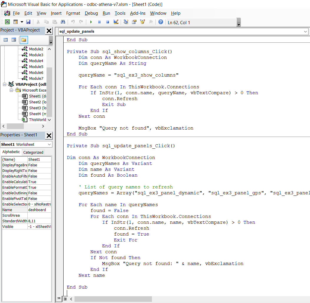
3.3 Use VBA to update select queries
The signal dropdown introduces a challenge, however. When the user changes the value of the message dropdown, we want to update the signal dropdown. But to keep this efficient, no other queries should be updated. Similarly, the user should also be able to update all dashboard queries without updating other connections in the workbook.
To solve this, we create VBA 'refresh' buttons for updating the devices/messages, the signals and the panel queries.
We ask ChatGPT for guidance and VBA code, which works out-the-box (see also our article on analysing CAN data with ChatGPT). With this, we can selectively update our queries.
Below is the final dashboard in action (we speed up the refresh time - more on this later):
Of course, the example is a bit silly as Excel is clearly not as well suited for dashboard visualisation as e.g. Grafana, Tableau or PowerBI. However, the exact same approach can be used for any analysis or report that requires multiple connections to be established with some commonality such as device ID or time period.
A core motivation for using Excel is the flexibility and versatility. While e.g. Grafana is both faster and more tailored for dashboard visualization, Excel lets you do practically anything - making it well-suited for e.g. hybrid analyses and reporting.
Example #4: Extract results from 1+ GB of data
The above examples use small data sets, but the same approach can be used across larger data volumes as well.
To illustrate this, we simulate a CAN message 'a' with two signals 'a1' and 'a2', which is recorded at 5 Hz continuously 24/7 for 1 year, resulting in ~3.5 GB of Parquet files (partitioned into 364 files, i.e. 1 file per day) and 150 million observations.
Let's extract the AVG, MIN and MAX of the signal a1:
As evident, the query takes about 12 seconds to refresh in Excel. If we look at the Amazon Athena 'recent queries' overview, we can see that Athena scanned 1.3 GB (only one signal was queried) and took 2.9 seconds to deliver the result. Importantly, our workbook size increased by only 8 kb by adding this query.
In other words, the Athena ODBC driver can extract insights across gigabytes of CAN bus data in seconds - without slowing down your workbooks. This lets you create scalable reports across your entire Parquet data lake.
Example #5: Visualise GPS data in Excel
Excel does not support GPS plots directly in sheets - but it does support this via a separate 3D Maps tool.
To show this, we create a workbook with two Athena queries: GPS position (latitude, longitude) and speed. As before, we aggregate the results to a shared time resolution.
When setting up each query we choose 'Load To/Only Create Connection' and we enable the 'Add this data to the Data Model'. Next, we go to the Data tab and select 'Relationships/New'. Here we select our two queries and specify the 'Time' column for both. This step allows Excel to relate the two tables.
Next, we go to 'Insert/3D Map/Open 3D Maps' and create a new tour. We should now see both our queries in the 'Field List'. If we drag & drop latitude and longitude into the Location field, the GPS route will show up on the map. Further, we can drag & drop Time into the Time column and speed into the Height column (with 'No aggregation').
With 3D Maps, we can e.g. plot a route with height based on the speed. While the tool is a bit clunky, it does enable some fairly powerful multi-layer geo-analysis across messages/signals.
How to set up Excel-DuckDB to query local CAN/LIN data
The previous examples used Excel-Athena to analyse DBC decoded CAN/LIN data stored in a Parquet data lake on AWS S3.
This is a common setup for users that have a CANedge2/CANedge3 connected to an AWS S3 input bucket as it is quick to set up an output bucket to contain the Parquet files - and query this via Athena.
However, some may prefer e.g. an open source self-hosted MinIO S3 bucket - and some may simply use the CANedge1 to log data offline. In such cases, users may consider other interfaces than Amazon Athena - and many exist as shown in our MF4 decoder article. One popular open source interface is DuckDB, which also offers an ODBC driver.

Below, we assume that you have created a local Parquet data lake using the MF4 decoders. This is simply a matter of drag & dropping your folder of MF4 files onto the mdf2parquet_decode executable, thus creating an output folder for each device. In our example, we'll use the same dataset as before and store our data in a folder called 'datalake'.
To install the DucKDB ODBC driver, follow this guide.
In Excel, you can now query the data via the ODBC datasource using queries like below:
As evident, this give us the same result as with Amazon Athena (the data is identical), but two key things are different:
- We did not need to configure the DuckDB ODBC driver
- We refer to tables via file paths, not predefined names
Next we'll show how to setup dynamic queries with DuckDB.
Differences between Excel-Athena and Excel-DuckDB
As with Athena, we can easily create a dynamic SQL query in DuckDB:
AVG(Speed) AS signal1,
AVG(SpeedValid) AS signal2,
AVG(SpeedAccuracy) AS signal3,
NULL AS signal4
FROM 'C:/.../datalake/3BA199E2/CAN2_gnssspeed/**/*.parquet'
WHERE t BETWEEN TIMESTAMP '2020-10-29 15:00:00' AND TIMESTAMP '2020-10-29 15:20:00'
GROUP BY TIME
ORDER BY TIME
As with Athena, we can gradually replace each part of the query with cell variables to make it dynamic.The end result is again an Excel PivotTable that allows us to query data from a Parquet data lake - now stored locally and interfaced via DuckDB.
This is powerful as DuckDB is vastly more efficient at processing large volumes of data compared to Excel - resulting in vast performance improvements and scalability vs. trying to load your local data directly in Excel through e.g. CSV files.

As evident from the query, DuckDB does not use the same syntax as Athena for grouping data in time bins. This is generally something to consider when using different SQL interfaces to query data from your Parquet data lake.
If you compare this query vs. the identical Athena query, you'll also note that we now use the STRFTIME and TIME_BUCKET functions, which are specific to DuckDB, serving a similar purpose as before.
With DuckDB, we have to construct the full absolute path to the table we wish to query from. A shortcut is to place your Excel workbook next to the data lake folder. By doing so, you can use the below Excel formula to extract the workbook folder path:
You can then combine the result of this path with the selected device ID and message name in order to construct your query.
In contrast to Amazon Athena, DuckDB does not support non-hive style date partitioning - hence we do not filter by date prior to filtering by timestamp (this might be improved upon later).
Performance considerations
Importantly, ODBC drivers add significant overheads as seen in below comparison of Excel-Athena vs. Grafana-Athena:
#1 Excel vs. Grafana: 5 MB, 10 panels
Both dashboards have approximately the same number of panels and use identical queries.
Further, if we look at the 'recent queries' within AWS, we verify that the Athena queries made by the Excel and Grafana have similar execution times (as expected).
However, Excel takes ~40 seconds to refresh the dashboard vs. ~4 seconds for Grafana. In other words, Excel is about 10x slower in loading this multi-query dashboard.
Excel refresh time: ~40s
Grafana refresh time: ~4s
#2 Excel vs. Grafana: 1 GB, 1 panel
We also tried comparing our 1 GB query (Example #4) from within Excel and Grafana. Here, Excel takes ~12 seconds to refresh the data, while Grafana takes ~4 seconds - making Excel ~3x slower.
In conclusion, the delay in Excel's ODBC queries appears to be due to a fixed overhead per query, not correlated with the amount of data scanned by Athena. Further, based on below Python evaluation, the overhead appears to be in Excel's ODBC implementation, rather than the Athena ODBC driver.
Looking at Excel-DuckDB, the overhead on ODBC queries is lower, which is perhaps to be expected given the fact that we use DuckDB to fetch locally stored data.
We also compared Excel's ODBC performance vs. Python using the library pyodbc. We compared the refresh time on a single panel query, which takes Excel ~5 seconds to load, while pyodbc takes ~1.2 seconds to load it. The actual Athena query execution time is ~0.5 seconds.
Excel refresh time: ~12s
Grafana refresh time: ~4s
The below plot summarizes the performance across integrations (note that Excel-DuckDB is not 'like-for-like' as data is stored locally).
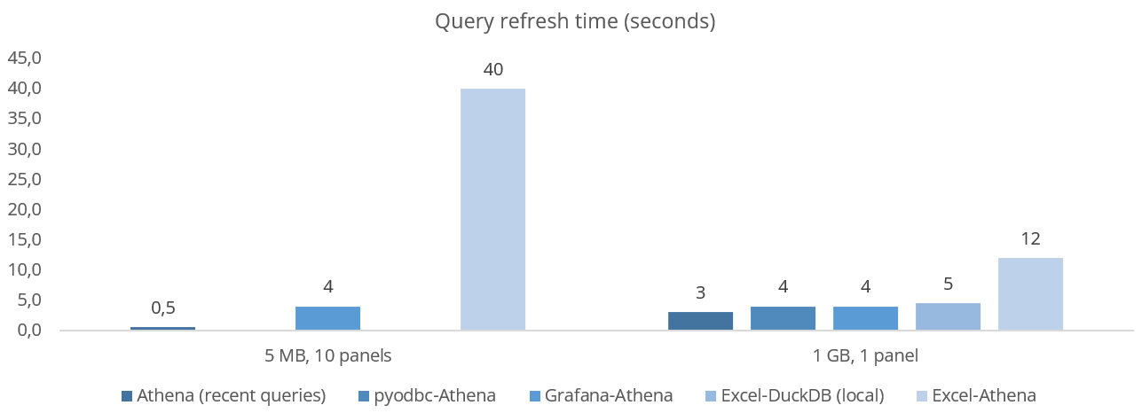 As evident, Excel's ODBC overhead makes it less ideal for refreshing many small
queries
As evident, Excel's ODBC overhead makes it less ideal for refreshing many small
queries
Overall, we believe the Excel-Athena integration is highly useful for the purpose of analysis/reporting across big Parquet data lakes where the fixed overhead is less relevant. Go download our data pack and try it out for yourself!
Ready to use Excel with your own CAN data?
Get your CANedge today!