Visualizing CAN Bus Data via Marple Dashboard Platform
Case Studies / Marple
Marple
Marple is a time series data analysis platform for engineering teams, designed for visualizing and analyzing large amounts of measurement data.
What problem did you solve?
Marple has helped great engineering teams like Lilium and Atlas Copco move their data analysis in the cloud. It is the logical step in organisations where lots of data is already captured, and analysis becomes the bottleneck.
However, sometimes we come across companies that lack a hardware solution for measuring the data itself. We have been looking for a reliable data logging solution to recommend to these teams. The CANedge2 from CSS Electronics seems like the perfect fit for customers in the automotive industry and beyond!

How did you solve it?
Together with the CSS Electronics team we figured out a convenient data workflow:
- The CANedge2 (incl. GNSS/IMU) captures raw CAN bus data in MF4 log files and uploads them to S3
- Data is decoded and written to InfluxDB via Python
- Analysis is done in Marple straight from InfluxDB
This gives immediate insights into the measured data. In the image below, you can see an overview of a trip made with a Kia EV6 in Denmark. The colorized map plot shows how the battery goes from 96% to 73% while driving. This view can also easily be shared with other people (see dialog in top left of the screen).
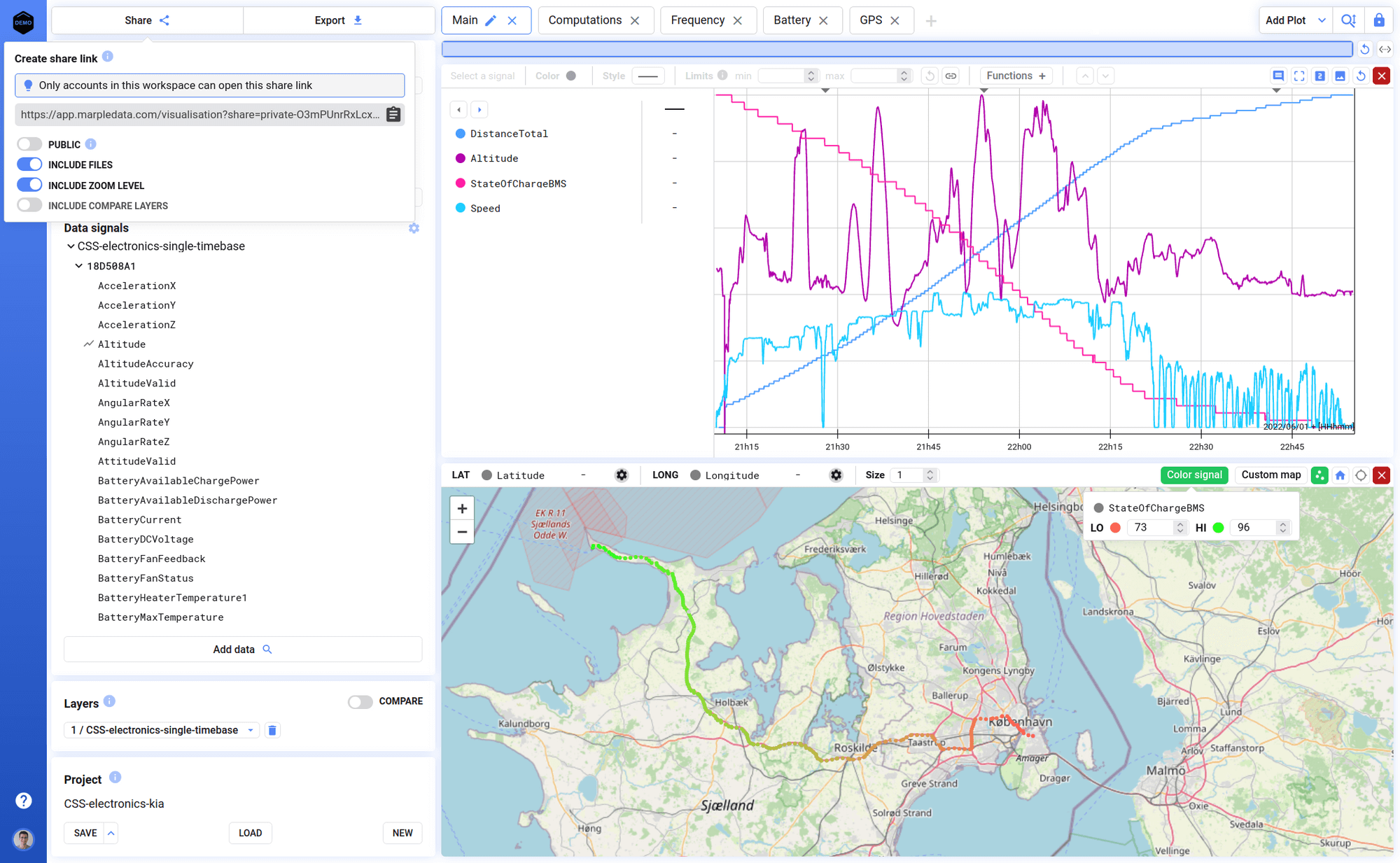
Below we've embedded a small embedded overview dashboard (click expand to view full screen):
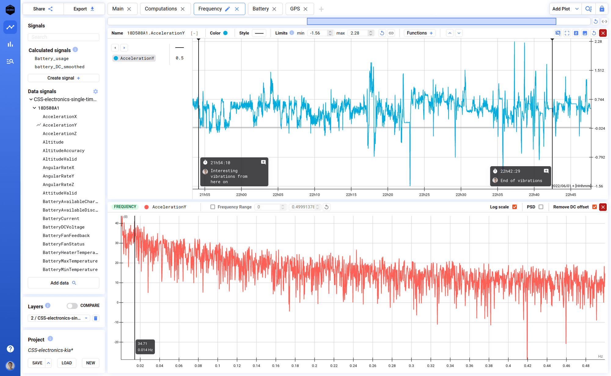
A second key feature is making frequency plots. The example below shows the frequency plot (FFT) of Acceleration Y. When you zoom to a different region in the time domain, the frequencies also update immediately.
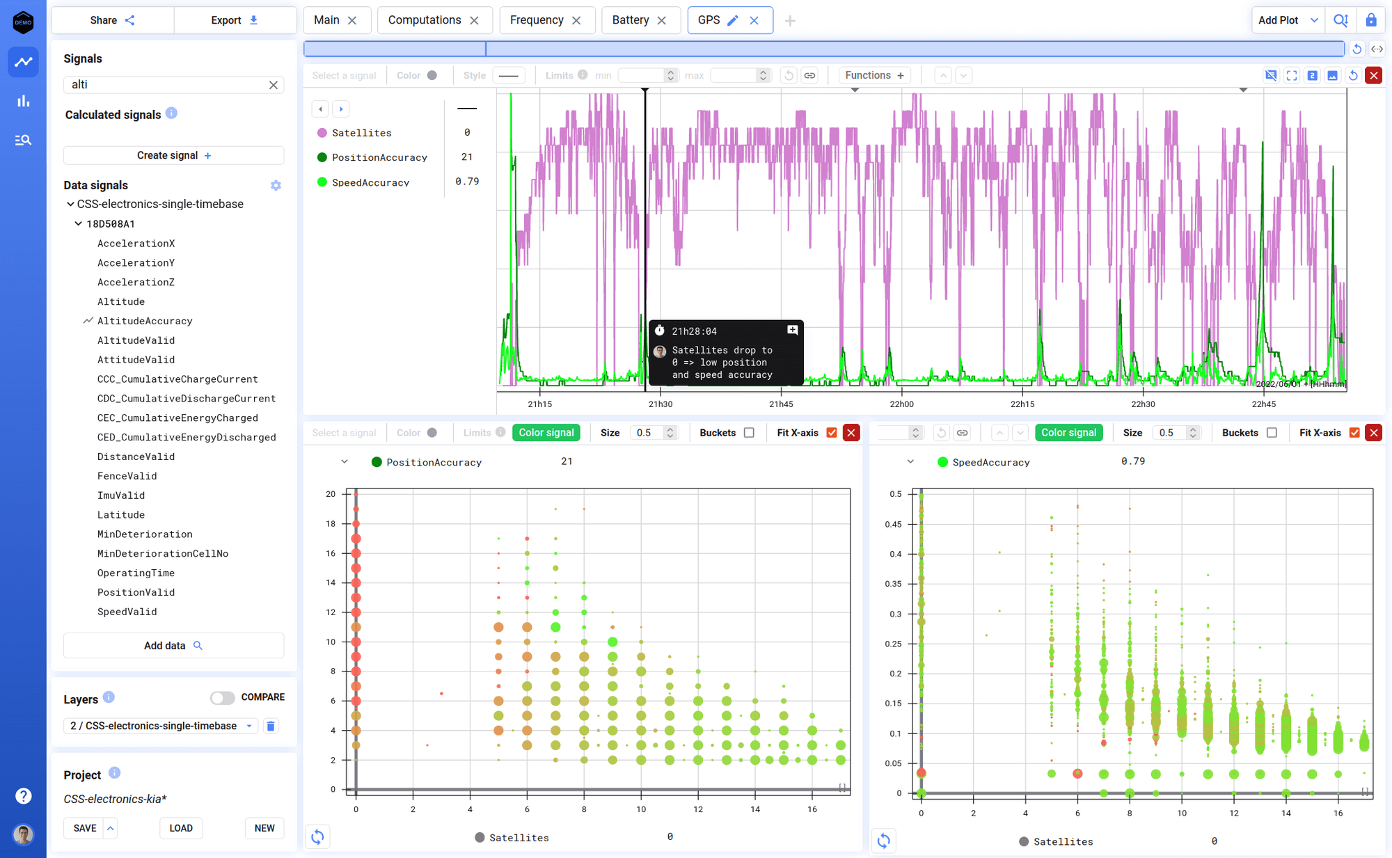
Color coded scatter plots also work interactively. This tab shows accuracy of speed and position (based on GPS). These signals change when the car has less or more satellite connections, giving interesting results. We can clearly see that when the car is connected to only a few satellites, the accuracy drops (= large value):
"The CANedge + Marple is a powerful combination for engineers looking to visualize and analyze their data with ease"
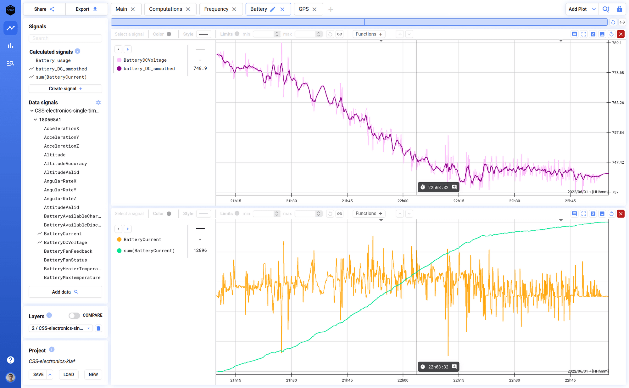
A final strength of Marple is to do calculations. The two plots below show
- A moving average filter applied to the Battery DC Voltage
- A cumulative sum on the Battery Current
Both calculations can be made with just a few clicks - they require absolutely no coding.
What benefit has this led to?
Marple + CANedge gives engineers instant insights into their vehicles. It gives them a data workflow that is:
- Easy to set up and easy-to-use
- Powerful in terms of the possible analyses
- Collaborative due to sharing feature
And most importantly: It's cost effective.
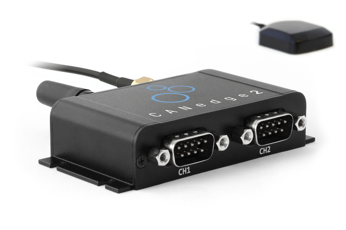 The CANedge2 incl.
GNSS/IMU is ideal for logging vehicle data + GPS/IMU
data
The CANedge2 incl.
GNSS/IMU is ideal for logging vehicle data + GPS/IMU
data
How does Marple compare vs. Grafana?
Marple may be compared vs. Grafana, another visualisation tool used frequently with the CANedge2.
Some key advantages of Marple vs. Grafana are listed below:
- UX: There is no need to make queries - simply select and view data using the UI
- Analysis: We focus on analysis of the data by engineers via tools like functions, calculations, FFT, scatter, stats and more
- Speed: When dealing with a lot of time series data Grafana tends to get quite slow, while Marple will always be instant
- Meta data: Data can be enriched with meta data (device, who measured it, ...) for easier filtration
- Data exploration: Because of the speed, you can very easily zoom/pan/... your data, making it easy to understand what is going on
— Nero Vanbiervliet, Co-founder, Marple
Ready to visualize your data?
Get your CANedge today!


